What's New in 2026-03 (Sparks)
Explore the latest features and enhancements introduced in the 2026-03 (Sparks) release. This release is all about giving you more control, speeding up everyday tasks, and making the platform feel smarter and more connected. From better template creation to richer branding and smoother workflows—there's a lot to explore.
🚀 Platform Highlights
🎯 Smarter Content, Less Guesswork
Managing templates just got a whole lot easier. With Content Categories, you can now define exactly what "good" looks like—whether that's a Poster, A4 brochure, or something more bespoke. Set sizes, page counts, and formats upfront, and the platform takes care of the rest. What this means for you:
- Designers always start with the right setup
- Fewer mistakes, more consistency
- A cleaner, more guided template creation experience
🧩 A More Powerful Template Studio
We've given Template Studio a thoughtful upgrade to make it more flexible and intuitive. Highlights include:
- Add descriptions to tiles—perfect for clearer navigation in button mode
- Replace static links with smart actions like:
- Create a Template
- Bulk Upload content
- Bulk Upload to Library Instead of sending users somewhere… tiles can now do things.
⚡ Faster Ways to Create & Upload
New workflows mean fewer clicks and faster results:
- Create Template (new flow): Start with a content category, pick a size, and even reuse an existing template as your starting point.
- Bulk Upload (improved): Upload multiple assets in one go—whether for static content or your library.
🔘 Better Buttons, Better Experiences
Button Mode just got a visual refresh. Choose from multiple layout styles to better match your design and make navigation clearer for users.
👤 A More Personal Touch
You can now show user names (and even profile photos) across the platform using the Show User Name feature:
- Display user initials or headshots
- Quick access to "My Profile"
- Adds a more personalised, modern feel
Plus, you can now dynamically insert user details like:
- First name
- Role
- Custom attributes Perfect for tailored homepage messages or internal comms.
🧑💼 Simpler User Management
We've streamlined the Add/Edit User experience into a single, easy-to-use page. Smart defaults now:
- Auto-select country, language, and time zone
- Hide irrelevant fields
- Reduce admin effort Less clicking. Less confusion. More efficiency.
🖼️ Smarter Image & Brand Management
Images are now more flexible than ever. Choose between:
- Uploading an image
- Selecting from the Library
- Pulling from a Brand Asset
This means:
- Better consistency across templates
- Easier updates when branding changes
🎨 Brand-Driven Colors
Your color picker now connects directly to your Brand Assets:
- Select approved brand colors instantly
- Keep designs consistent without manual input
- Update once, reflect everywhere
Learn more about Color fields →
🔄 One-Click Thumbnail Updates
Updated a brand asset? Now refresh all related template thumbnails in one go. No more manual fixes—just:
- Select the brand asset
- Hit update
- Let the system do the heavy lifting
Learn more about Update Thumbnails →
📩 Clearer Download Approvals
No more guessing. Users now receive:
- Confirmation when a download is submitted
- Notification when it's approved
- Feedback if it's rejected Simple, transparent, and user-friendly.
Learn more about Download Approvals →
🧱 More Dynamic Tiles
Dynamic tiles now support plural naming, making lists feel more natural and intuitive.
Learn more about Dynamic Tiles →
🗂️ Better Visibility in Asset Management
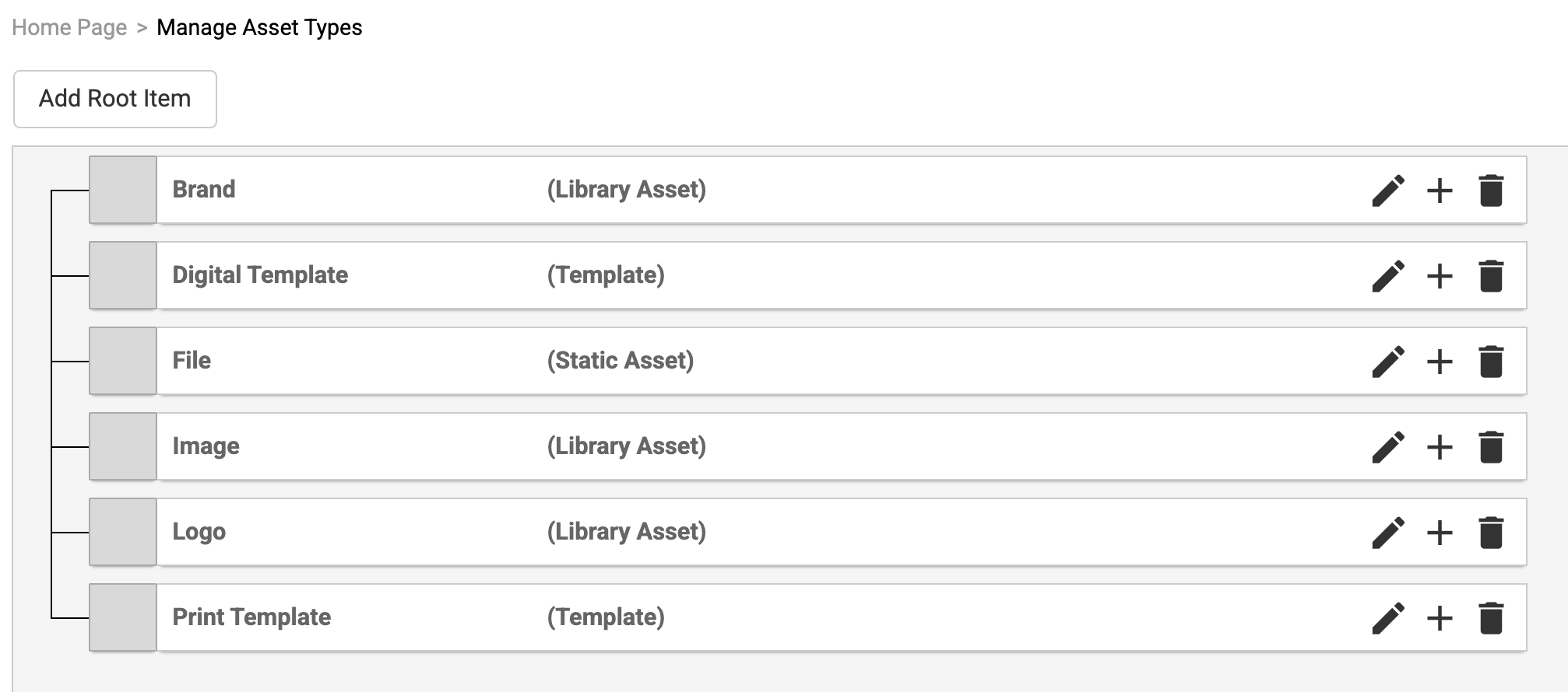
You can now quickly see the type of each asset in the Manage Asset Types view—making organisation easier at a glance.
Learn more about Manage Asset Types →
🛠️ Template Features
⚡ Faster Testing
You can now:
- Download output directly from the test page
- Send test files straight to print
- No need to run through the full user journey just to validate a design.
Learn more about Faster Testing →
🔗 Clickable PDFs
Add hyperlinks to:
- Text
- Images
Whether you're a template author or end user, creating interactive PDFs is now simple and seamless.
Learn more about Clickable PDFs →
Learn more about the new features below!
Content Categories
New functionality has been implemented to assist in the administration of valid content types and sizes for templates and static content.
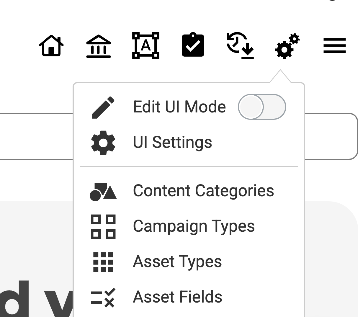
When this is enabled, a new option is made available under the “cogs” to any administrator who has the Manage Content Categories permission.
Within this option, an administrator can build a table of valid content and sub content types such as Poster, A4, A3, etc. In addition, they can define the supported sizes (in a preferred unit of measurement) and state the number of default pages. Each of these entries are then linked to specific template asset types.
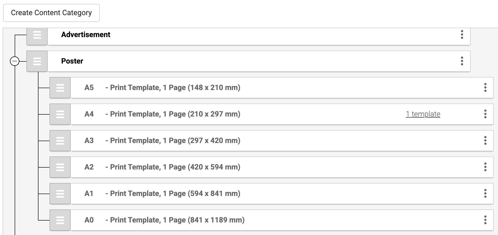
This then creates a matrix of predefined types and sizes that is presented by the application to the template designer when creating / amending a template.
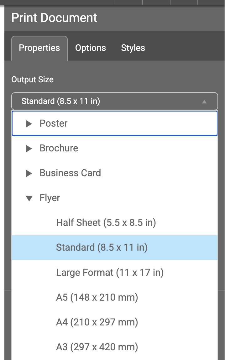
Note: The "Asset Type Search Filter" functionality should also be enabled to ensure that all content is tagged correctly with the appropriate Content type i.e. Poster, Brochure, etc.
When creating or editing a template, the template author must select the appropriate entry from the list of available Content categories. The information from the table entry selected is then used to control the size and number of pages within the template:
New Design for Template Studio
Enhancements to the Static tile functionality has been introduced. The first is to allow for a Text description field to be entered for the Static tile:
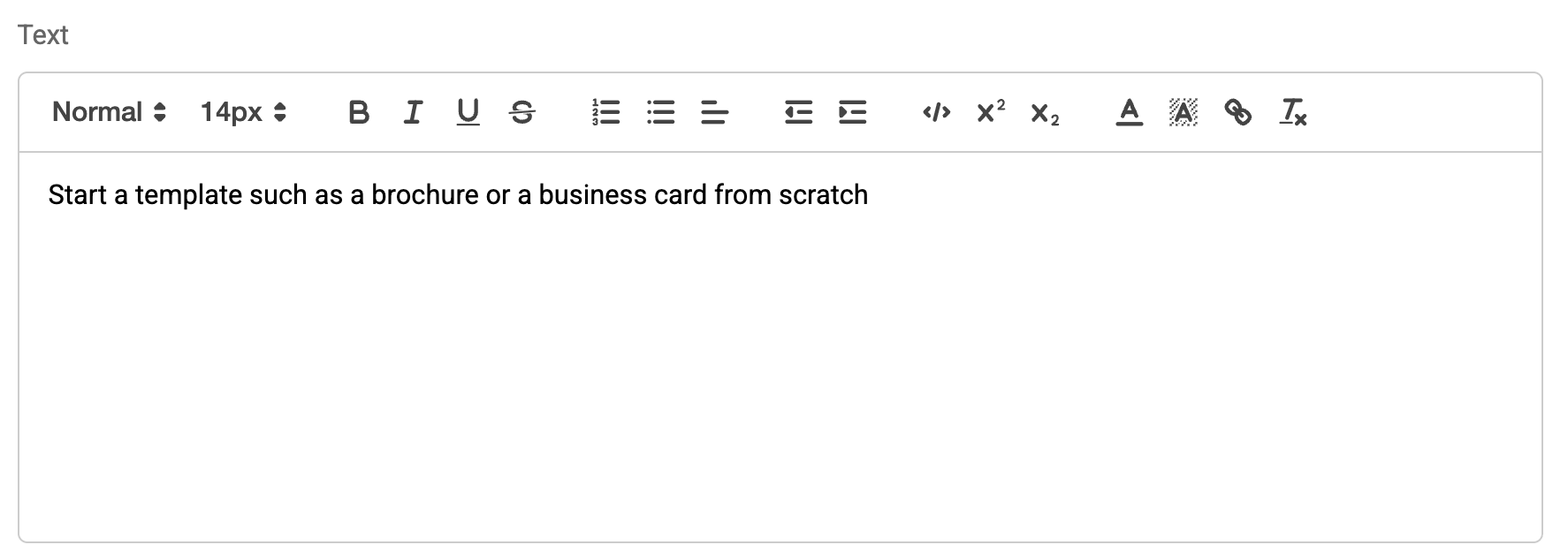
This is then used when the “Button mode” is selected for a Tile list, (see further details regarding how this operates below).
Additionally, the Static tile functionality now allows the administrator to select from a predefined list of “options” to be called when the tile is clicked, rather than a specific URL or email address.

When the “Option” radio button is selected, then the following options are available to be used for a tile:
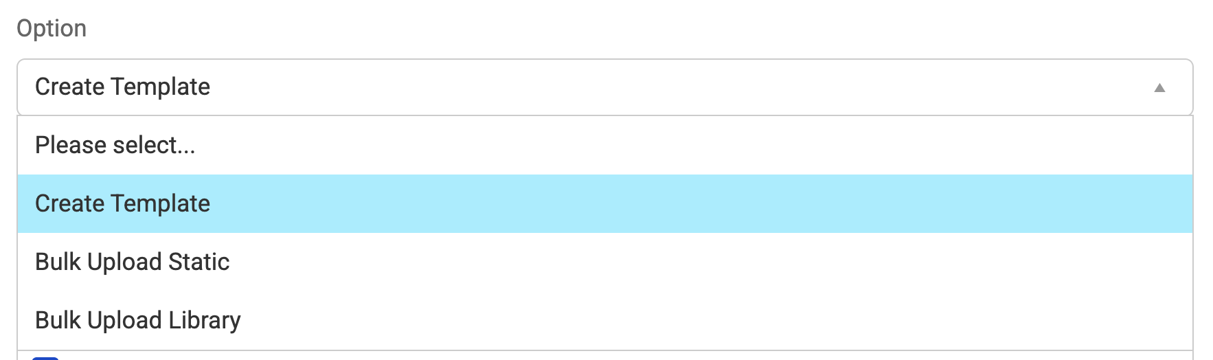
Create Template
This option triggers a new “Create Template” dialog:
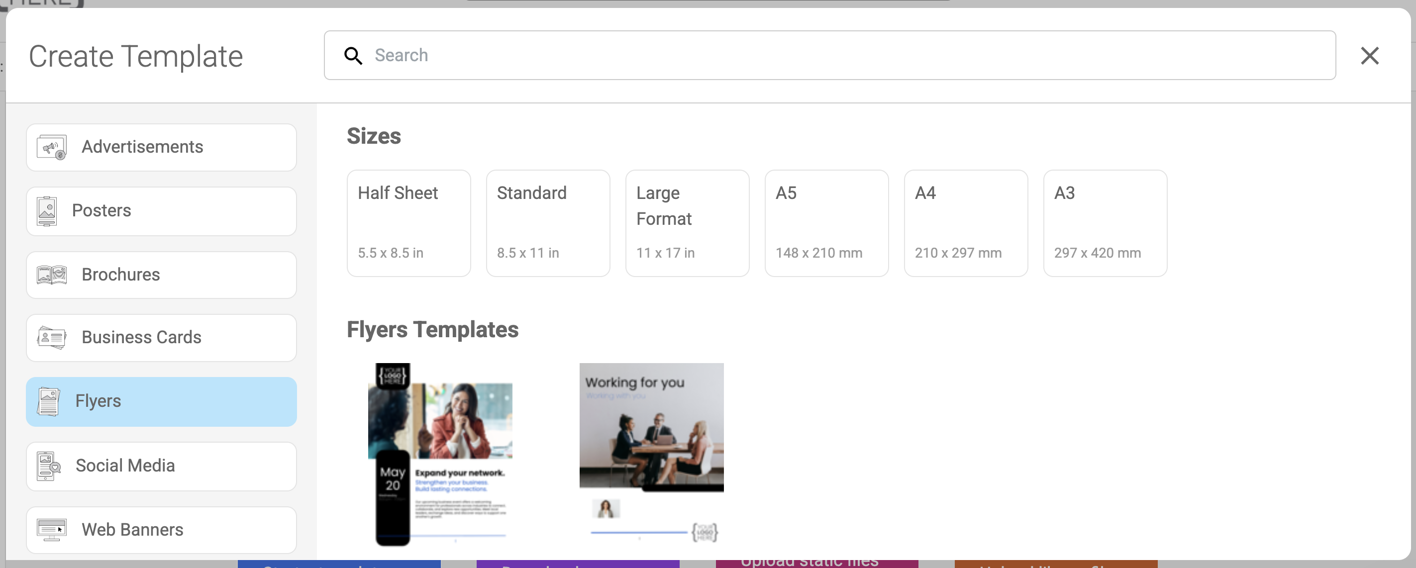
This shows the content category entries and size details that the template designer can chose before presenting them with the template authoring page initialised with the correct details. Any current templates that exist for the selected content category are also shown. Selection of one of these will trigger this to be used as the starting point for the new template
Bulk Upload Static: This option triggers a new “Bulk Upload” dialog:
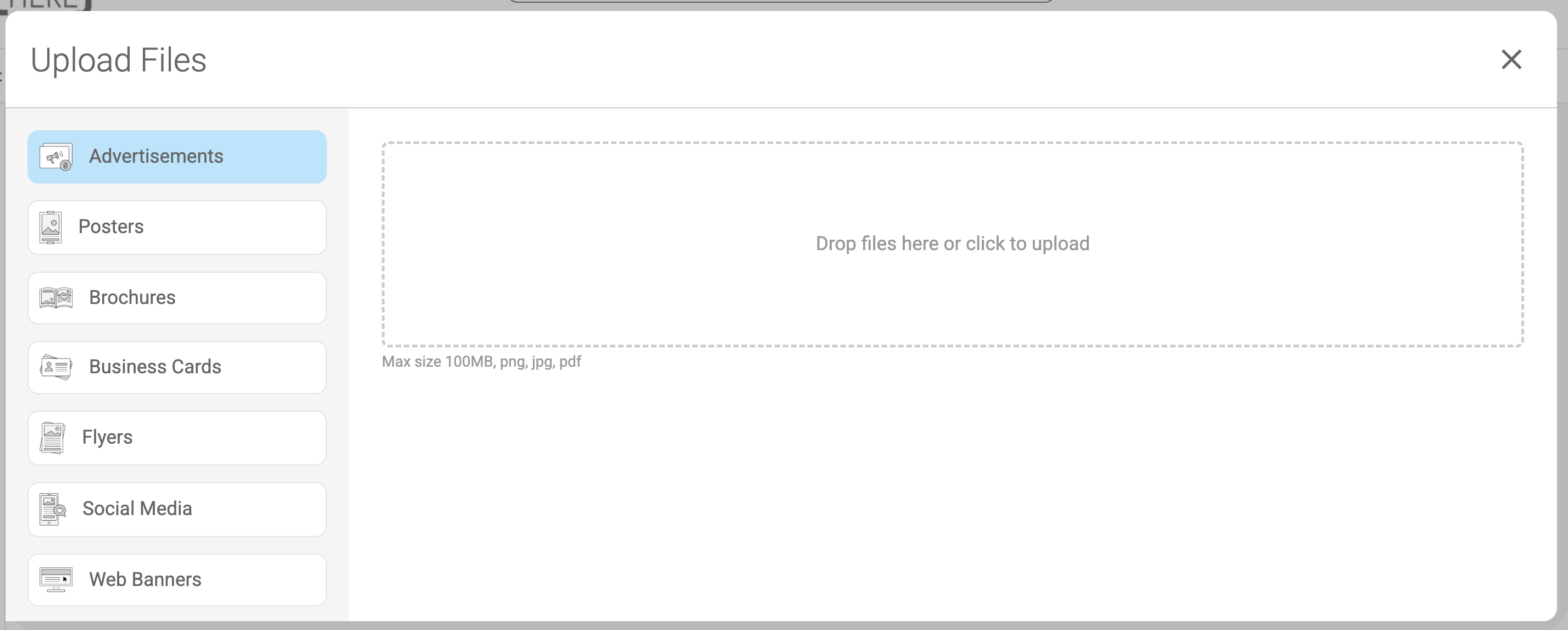
This shows a list of the Content Categories entries that the administrator user must select from prior to using the drop-area to upload one or multiple items as static files of this type.
Bulk Upload Library: This option triggers a new “Bulk Upload” dialog:
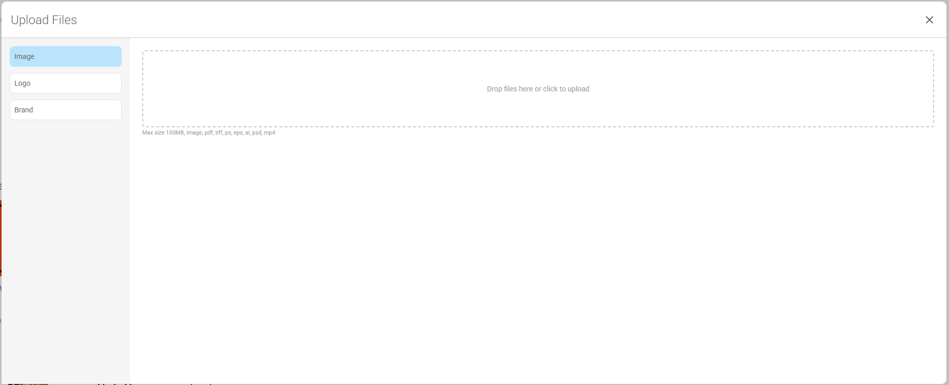
This shows a list of Library item asset types, that the administrator user must select from prior to using the drop-area to upload one or multiple library items of this type.
Button Mode
When the “Button mode” is selected a new set of options is now presented, as follows:
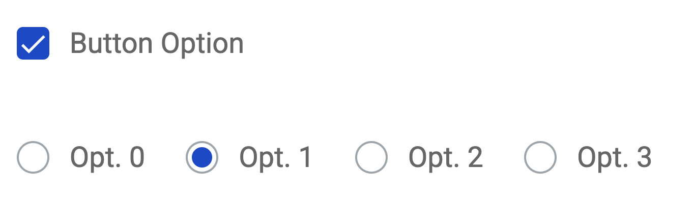
These options apply different formats to the button mode items shown in the tile list, as follows:
Option 0 (original layout):
Option 1:
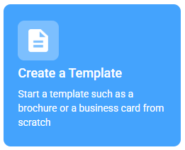
Option 2:
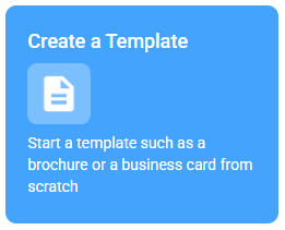
Option 3:
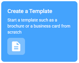
New Application Setting
A new feature has been introduced into the application settings. This allows the administrator to control whether the new feature is to be used or not on the account:
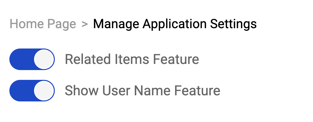
Show User Name Feature
When the “Show User Name” feature is enabled, then this causes the name of the user, along with a badge (which uses the user’s initials by default), to appear on the top right-hand corner of each page, as follows:
If there is a user profile attribute called “Headshot” which is populated with an image of the user, then this image is shown in the badge, as follows:
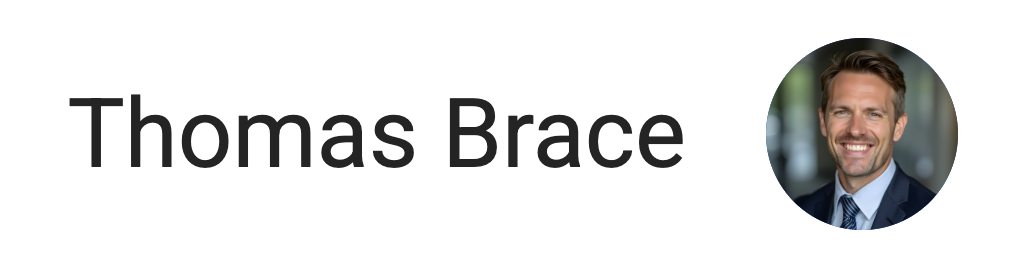
When the badge is clicked, then the user’s “My Profile” page is displayed.
Inserting User data into a text section on the Home or a sub page
It is now possible to insert user profile fields into a text section by using placeholder fields. These must be entered exactly as follows to work properly:
| Placeholder | Description |
|---|---|
[[First]] | This will show the user's first name |
[[Last]] | This will show the user's last name |
[[Email]] | This will show the user's email address |
[[Phone]] | This will show the user's phone number |
[[Role]] | This will show the user's assigned role(s) |
In addition, any user profile attribute may be inserted into a text section, using the following placeholder syntax:
[[xxxxxxxx]] Where xxxxxxxx is the actual name of the User Attribute i.e. Job Title
Add/Edit User Layout
The layout of the Add and the Edit user page has been enhanced to show all relevant fields on a single page, rather than being separated into different tabs.
The first section of the page shows the basic “User details”, that must be completed , as before:
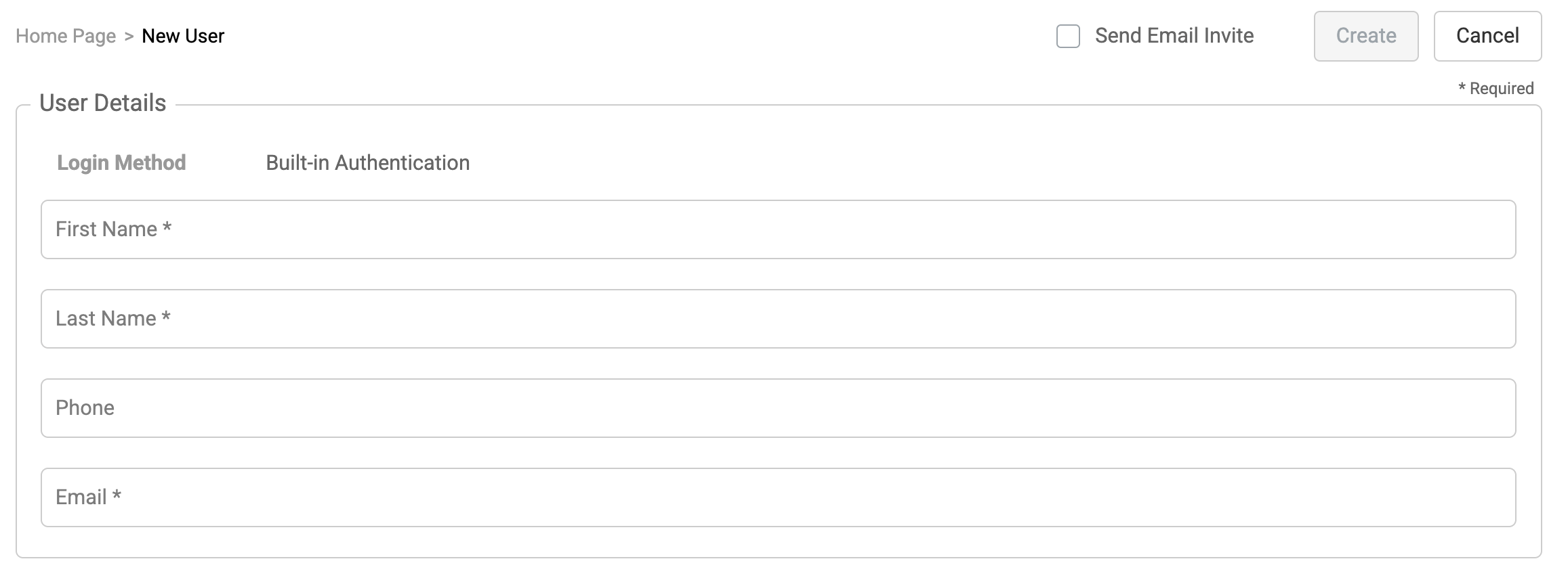
Next the following section for the “User information” is shown. This may be hidden or reduced in size, where settings can be defaulted or are not required:

The following logic is applied to the above fields on the Add User page:
- Where there is only one default country being used, then this setting is automatically selected for the user and the field is hidden.
- Where there are no UI Languages being used, then this setting is automatically selected and the field is hidden.
- When the Built-in login method is being used, then the Status setting is automatically selected and the field is hidden.
- When “UK” is selected as the default Country, then the Time zone is automatically set to “Dublin, Edinburgh, Lisbon, London”
- When “US” is selected as the default Country, then the Time zone is automatically set to Eastern Time (US and Canada)
Note: The above fields are editable via the Edit user page.
Below this, the "Roles" section is shown. This allows for the relevant role(s) to be selected for the user, as before.

Finally, the “User fields” section is shown. These are fields which are shown based on them being defined as “User attributes” and applicable to a user profile.
Image Attributes
The current method for populating an image attribute on an asset has been enhanced to include a new dropdown option. This defaults to “Upload image” to mirror the previous functionality that allows an image to be uploaded, as follows:
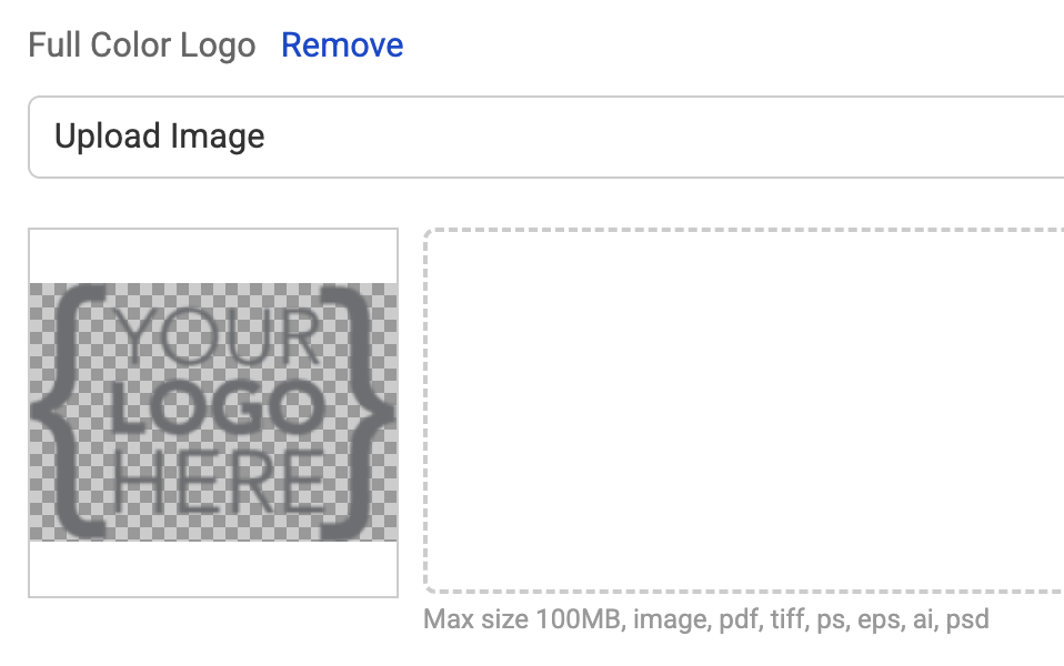
By selecting the new dropdown, it is now possible to select a new “Use Library Asset” option. This prompts the user to select a Library asset “Asset type” and then provides the ability to search across assets of this asset type and select the image to use from these, as follows:
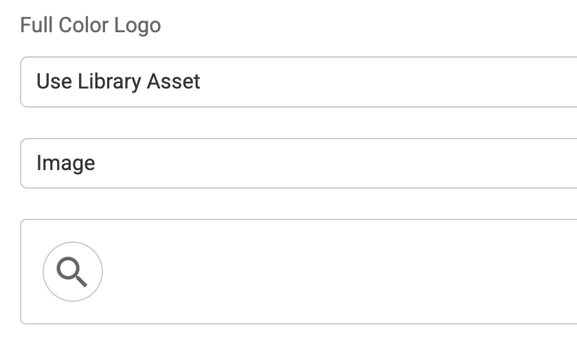
Image fields
Where the image is a field used within the application, such as the Header logo for the account, then the same enhancement mentioned above is available, but with an additional option of the “Brand Asset” being shown in the dropdown. When this is selected, then this prompts the user to select an asset (by name) from a list of those available. Once this is done, the image attributes from the selected Brand asset are shown so that one may be selected to be used.
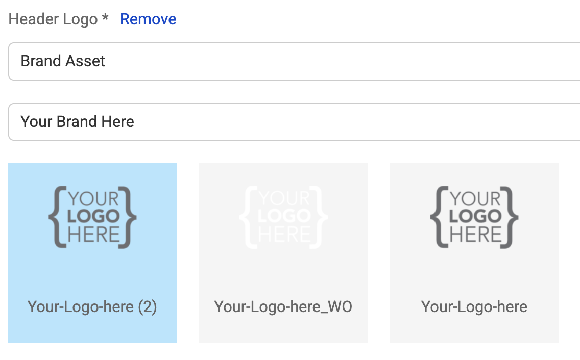
This change is applicable to images found in:
- An image section
- A background image on a page
- An image in an ad-rotator
- An image in a tile list section
- An image in a footer section
Color fields
The current method for setting a color field within the application such as Primary color, has been enhanced.
When the clicking on the swatch for the color, a new color picker is shown:

This defaults to a color picker (as before), allowing for a color to be selected for the field. However, when “Brand” assets are being used, the color picker also includes a brand tab option:

When this is selected, a new “Brand Asset” dropdown is shown. This shows a list of Brand asset names, to allow for the appropriate brand asset to be selected. Once this is done, all color attributes held on the selected brand asset are shown so that one can be selected to be used for the color setting.
Color attributes
When a color attribute is to be edited, it is now possible to click the swatch color in order to access the color picker.
Download Approvals
The approval process has been enhanced to generate confirmation emails to users who have submitted a download request that requires approval. Following review and approval of the request by the approver, the user will receive an email to advise that the download is now ready and visible on the “My Downloads” option.
Where a download request is rejected by the approver, then a rejection confirmation email is sent instead to the requesting user.
Dynamic Tiles
A plural name field has been added to the content category attribute (which is used for tagging), and this is now available to be used for a Dynamic tile list.
The configuration of the dynamic tile entry now includes a new setting:
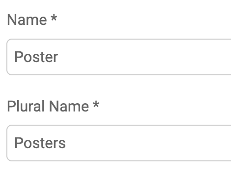
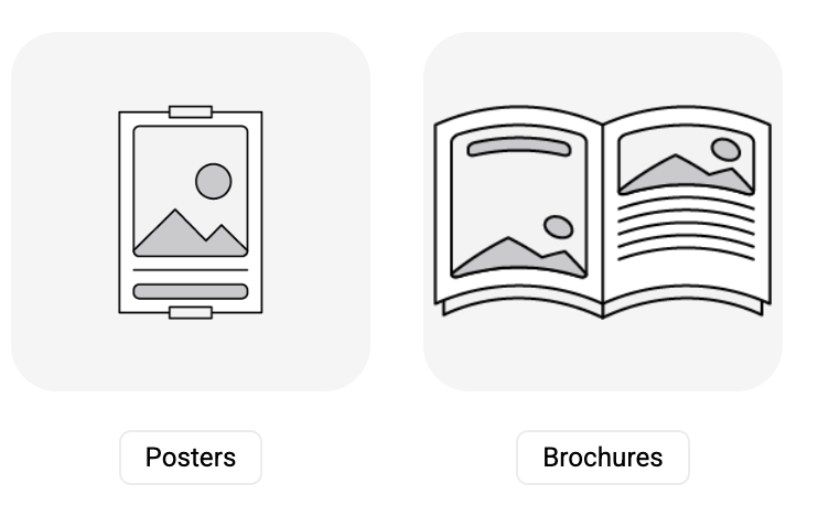
When this is set, the plural names for the entries are used, as follows:
Manage Asset Types
The “Manage Asset Types” function has been enhanced to show the type of each entry, when the list page is displayed, as follows:
Update Thumbnails
Brand assets can now be implemented and used in the application, as a central location for storing brand images, text and/or preferred colors which are then used by any number or all of the templates. However, should any image, text or color (which is stored on the brand asset) change, then this should also be reflected across all of the template thumbnails that use the brand asset.
With this in mind, a new “Update thumbnail” tile and associated function have been developed. The new tile type is configured, as follows:
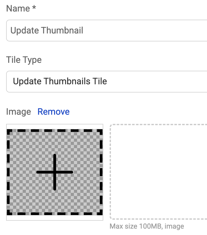
There is a content type parameter, which can be left as the default “all” (meaning all types are to be updated), or which can be configured to a specific content type i.e. Print Template.
When an administrator selects the new tile, a new dialog box is shown for the content type selected and with a brand asset dropdown. This is so the brand asset which has recently been changed can be selected:
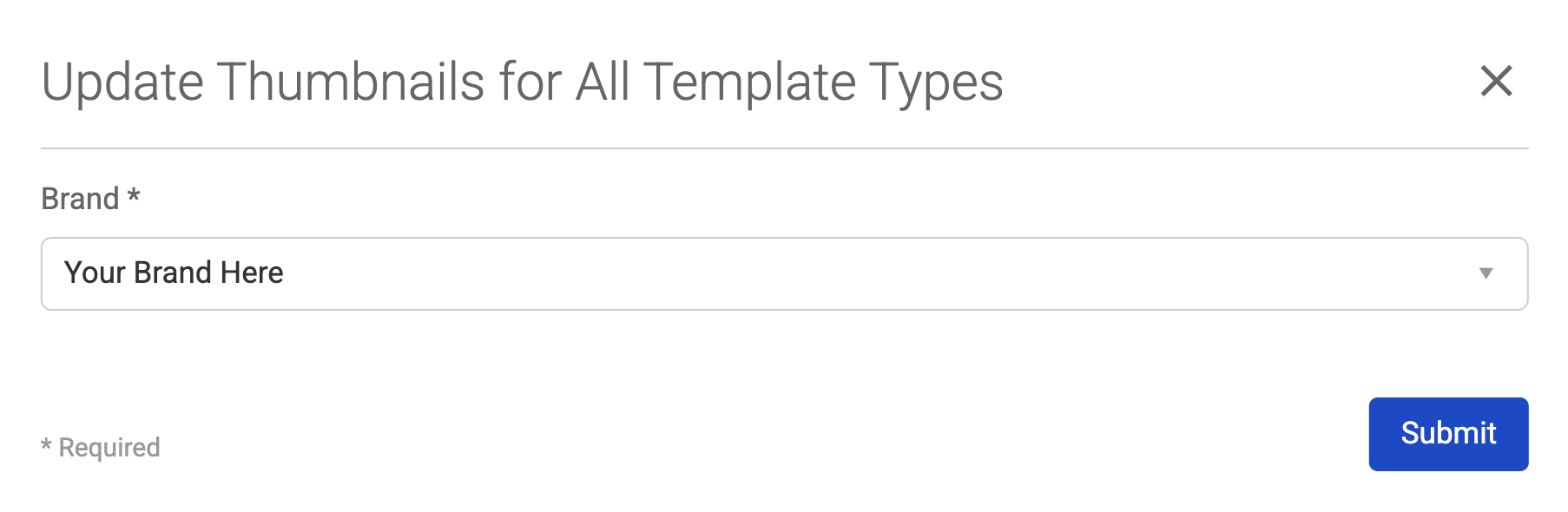
Once the brand asset has been chosen, then the process is triggered by selecting the submit button whereby the following confirmation message is issued:

The update thumbnail process looks at every template for the configured content type that currently has an auto-generated thumbnail. Each template that matches this criteria is checked to see if it uses any image, text or color field from the nominated brand asset. If this is confirmed as true, then the thumbnail for the template is regenerated and saved on the item.
If the template is not for the correct content type, then the template is ignored by the process. If the template does not have an auto generated thumbnail, then the template is ignored by the process. If the brand asset is not used by the template, then the template is ignored by the process.
As template thumbnails are updated, then the asset is shown as modified on the asset library page.
Template Features
Faster Testing
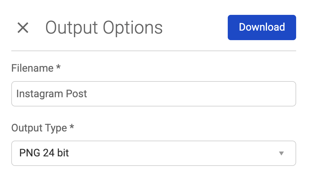
Download template output from test page
Template authors can now download generated output directly from the test page during testing. This removes the need to go through the end-user customization flow, making validation faster and more efficient.

Send test file to printer
Test files can now be sent directly to a printer from both the template author and admin test pages. This eliminates the need to create a full order just to print output during testing.
Clickable PDFs
PDF hyperlinks
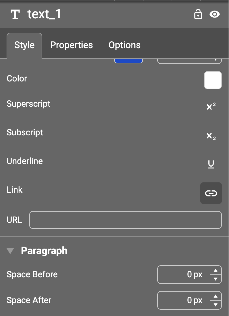
We’ve added functionality to allow you to add hyperlinks to both text and images in PDF output. The links can be added either by the template author or by the end user during customisation via a question or inline editing.