What's New in 2026-05 (Toto)
Explore the latest features and enhancements introduced in the 2026-05 (Toto) release. From platform improvements like smarter Brief request attachments, a refreshed Manage Users layout, and new delivery workflow controls, to template authoring enhancements including background color, letter case, and EPS output — there's a lot to explore.
🚀 Platform Features
📎 Brief Request — File Drop Area for Attachments
You can now drop file attachments directly onto a Brief request using the message area, which now accepts files as well as text. Uploaded files appear at the foot of the drop area, and the existing paperclip icon remains available for browsing.
Learn more about Brief Request Attachments →
🔗 New "Combine Order XML" Setting for SFTP
When a partner is configured to use SFTP, a new setting allows all order items to be combined into a single XML file rather than sent as individual files per item.
Learn more about Combine Order XML →
✅ Show Items That Require Approval
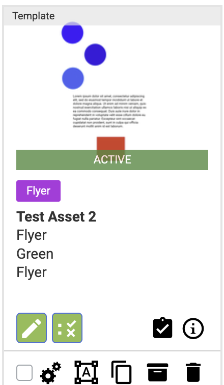
A new Approval icon now appears on any item in the Asset Library that has an Approval chain associated with it, making it easy to spot at a glance.
Learn more about Approval Icons →
👥 Manage Users Layout
The Manage Users page has been simplified — edit and delete icons are now inline on each row, a new info flyout shows remaining user details, and an expand icon reveals all roles across all users at once.
Learn more about Manage Users →
👁️ Column Section — Role Visibility
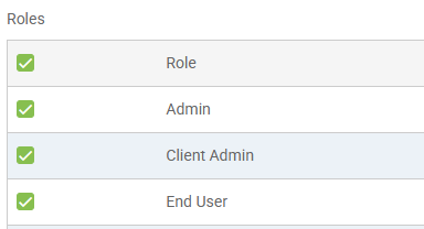
Column sections now support the standard Role visibility configuration, giving administrators control over who sees each column section on a page.
Learn more about Column Section Role Visibility →
🎨 Tile List Entry — Background and Hover Colors
Individual tile entries can now override the account-level tile color settings. Checking "Override Tile Color Settings" reveals swatches for background, text, hover, and hover text colors on a per-tile basis.
Learn more about Tile Color Overrides →
🚚 Changes to the Delivery Workflow Functionality
A new application setting controls whether Delivery Workflow options are checked by default. The "Via Partner" option now requires at least one associated Output Spec to be set.
Learn more about Delivery Workflow →
🛠️ Template Features
🎨 Background Color for Print Templates
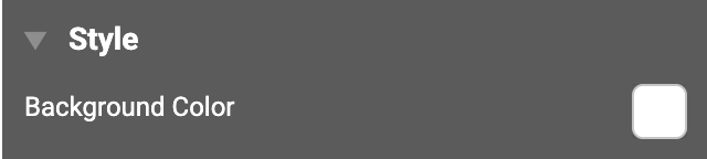
Print templates now support background color control. The new Style section in the document properties panel replaces the previous "Fill" label with "Background Color," making it consistent across print and digital templates. Backgrounds default to white. Selecting transparent shows the transparency grid in edit mode, displays as white in configure mode, and produces a genuinely transparent background in the output PDF.
Learn more about Background Color →
📄 EPS as an Output Option
EPS is now available as an output type for both print and digital templates. It is unselected by default for new and existing asset types — nothing changes until you opt in.
✂️ Control Bleed and Cutter Guides per Output Spec
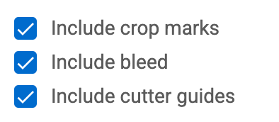
Two new checkboxes — "Include bleed" and "Include cutter guides" — have been added to the Output Spec configuration. Both default to checked, and all existing Output Specs are automatically treated as checked.
Learn more about Output Spec Controls →
🔡 Letter Case Control for Text Elements
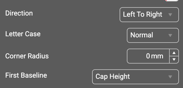
Template authors can now control letter casing directly from the properties panel. A new Letter Case dropdown offers Upper, Normal, and Lower options, and defaults to Normal.
Learn more about Letter Case →
🧩 Smoother Editing of Grouped Elements
Working with groups is now easier for both template authors and end users. New groups have the Anchored Group property turned on by default. Single-clicking selects the group; double-clicking drills into the individual element.
Learn more about Group Editing →
📋 Duplicate Pages During Customisation
End users can now duplicate pages on templates that have the Manage Pages option enabled. A new duplicate button in the spread navigator inserts a copy of the selected page immediately after it.
Learn more about Page Duplication →
Learn more about the new features below!
Background Color for Print Templates
We've added background color control to print templates. The option now lives in a new Style section of the document properties panel — the same control previously called "Fill" on digital templates has been renamed to "Background Color" and works consistently across both template types.
Backgrounds default to white. Selecting transparent shows the transparency grid in edit mode, displays as white in configure mode, and produces a genuinely transparent background in the output PDF.
EPS as an Output Option
We've added EPS as an output type for both print and digital templates. The option is available alongside the existing output types and is unselected by default for new asset types as well as all existing ones, so nothing changes until you opt in.
When an end user orders a template as EPS, single-page templates produce a single EPS file and multi-page templates produce a zip containing one EPS per page.
Control Bleed and Cutter Guides per Output Spec
We've added two new checkboxes to the Output Spec configuration: "Include bleed" and "Include cutter guides." Both default to checked, and all existing Output Specs are automatically treated as checked — no edits required.
When either option is unchecked, the corresponding layer is omitted from the output PDF for both the order workflow and the download workflow.
Letter Case Control for Text Elements
Template authors can now control letter casing on text elements directly from the properties panel. A new Letter Case dropdown sits under the Link control and offers three options: Upper, Normal, and Lower.
Upper and Lower transform the displayed text and override any casing set on a question, style, or placeholder. Normal preserves the entered content as-is and respects existing case settings. The control defaults to Normal.
Smoother Editing of Grouped Elements
We've made working with groups easier for both template authors and end users. New groups now have the Anchored Group property turned on by default.
In the editor, single-clicking an element in a group selects the group; double-clicking drills in to the individual element so you can reposition and edit it exactly as you would an ungrouped element. The group's bounding rectangle updates automatically when you deselect. The Reposition Element option remains disabled while a group is anchored and becomes available when it isn't.
For end users, elements inside a non-positioned group are now selectable and editable on their own, following each element's own customisation options. Anchored-group rules continue to apply as content changes. Groups with Position enabled keep the existing behaviour — single-click selects the group for repositioning, double-click drills into a specific element.
Duplicate Pages During Customisation
End users can now duplicate pages on templates that have the Manage Pages option enabled. Selecting a page reveals a new duplicate button in the spread navigator, which inserts a copy of the selected page immediately after it.
🚀 Platform Features
Brief Request — File Drop Area for Attachments
When managing your Brief requests, it is now possible to drop file attachments directly onto the request using the message area, which now accepts files as well as text.
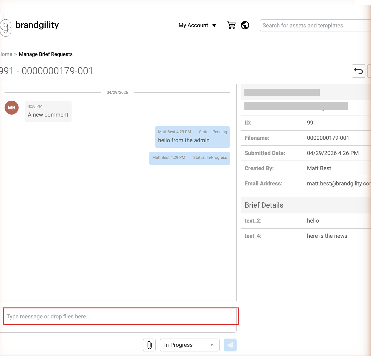
When dropping a file into the drop area, the area changes to indicate it is ready to accept the file.

Once the file is uploaded, it appears at the foot of the drop area.

The existing paperclip icon is still available to browse your local machine for files.
New "Combine Order XML" Setting when using SFTP
When a partner is configured to use SFTP, a new setting is shown. When checked, the XML data generated and sent to the SFTP server will be formatted so that all items for the order are included in one XML file, rather than each item being sent as an individual piece of XML.

Show Items That Require Approval
When viewing the Asset Library, a new Approval icon is shown on any item that has an Approval chain associated with it.

Manage Users Layout
The layout of the Manage Users page has been simplified to make it easier to view user details and reduce the need for horizontal scrolling when multiple roles are in use. Edit and delete icons have been added inline on each row, and the existing right-click options remain available.
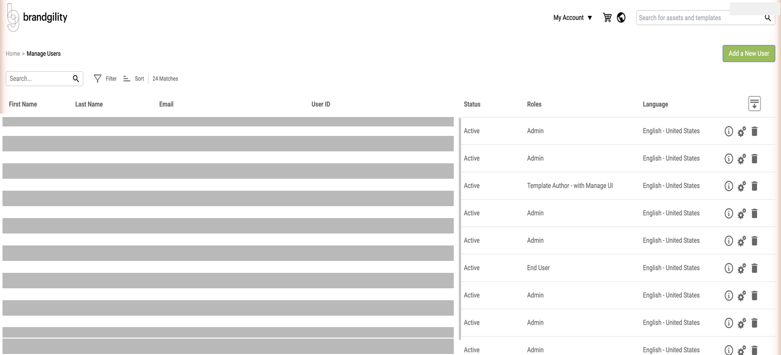
A new "i" icon on each row opens a flyout showing the remaining user information. Where multiple roles are assigned, only the first 40 characters are shown with an ellipsis; hovering reveals the full list.
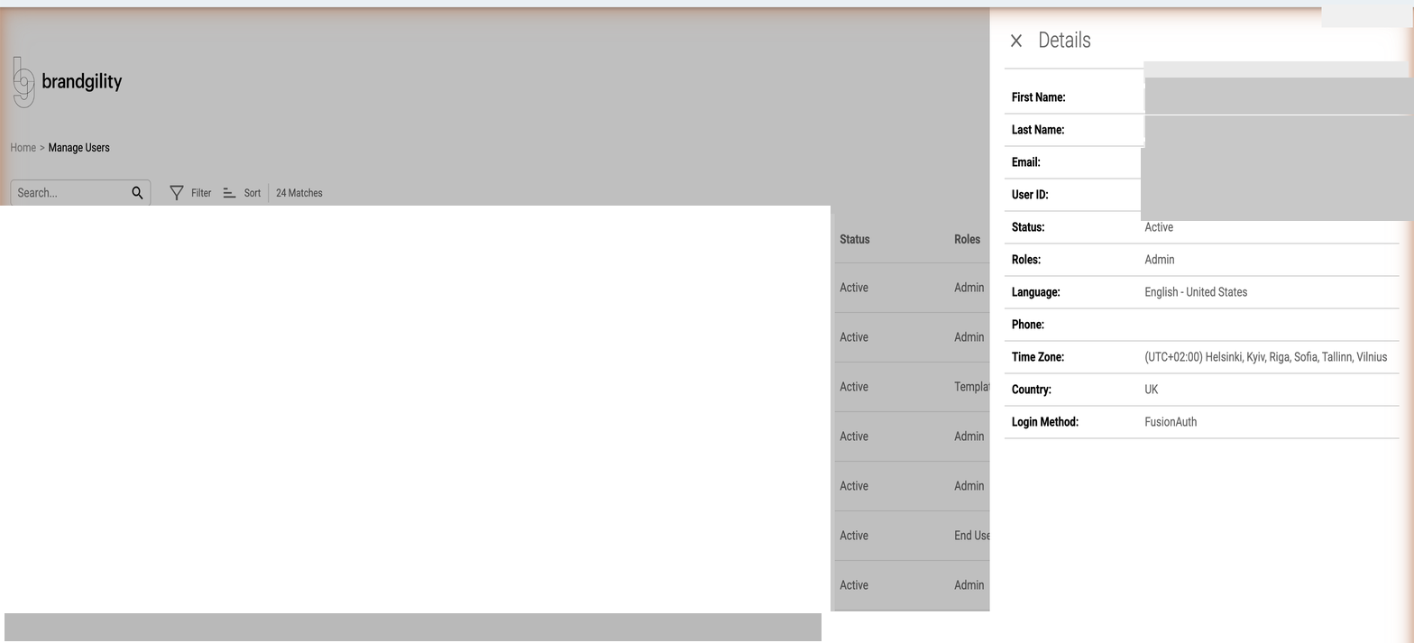
An expand icon at the top of the page shows all roles for all users at once.


Column Section — Role Visibility
The configuration of a column section has been enhanced to include the standard Role visibility section. This allows the administrator to control the visibility of the column section when shown on a page.
Tile List Entry — Background and Hover Colors
A tile list entry has been enhanced to allow the administrator to specify override settings for the background and hover colors for a specific tile entry. This is toggled by checking the "Override Tile Color Settings" checkbox.

When checked, color swatch settings are shown for Tile Background Color, Tile Text Color, Tile Hover Color, and Tile Hover Text Color.

Changes to the Delivery Workflow Functionality
Application Settings: A new setting — "Check all Delivery Workflow Settings by default" — has been added. When enabled, all Delivery Workflow settings are checked by default for new assets; when disabled, all are unchecked. The validation when saving an asset has been updated to allow for none of these settings being set.

Linking Delivery Workflow "Via Partner" to an Output Specification: When "Via Partner" is checked, the asset must have at least one associated Output Spec. When "Via Partner" is not checked, this requirement does not apply. A deployment script will update any existing assets where "Via Partner" is checked but no Output Spec is associated — the "Via Partner" setting will be unchecked for those assets.