What's New in 2026-07 (Ultravox)
Explore the latest features and enhancements introduced in the 2026-07 (Ultravox) release.
🛠️ Template Features
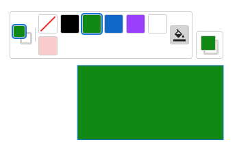
Inline Color Picker for Shape Elements
End users can now change the fill and stroke colors of rectangle, oval, and polygon elements directly on the canvas — no separate question required. Stroke color editing is also available on line elements. Template authors opt in per element by enabling the Change Style toggle in the properties panel, and can configure predefined color swatches and/or a free color picker.
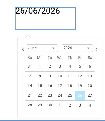
Inline Date Picker
Date fields now present an inline calendar picker directly on the canvas, allowing end users to select a date without typing. Template authors set a text element's Content Type to "Date" and can configure the date format, including a custom format option. A "Default to today's date" checkbox is also available.
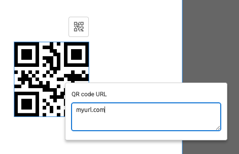
Inline QR Code URL Editing
End users can now change the URL of a QR code element directly on the canvas. Template authors opt in per element using the "Edit QR code" option on the Options tab. When selected, an inline editing bubble opens allowing a new URL to be entered, with validation to prevent invalid URLs being applied.
Export Print Templates as JPG or PNG
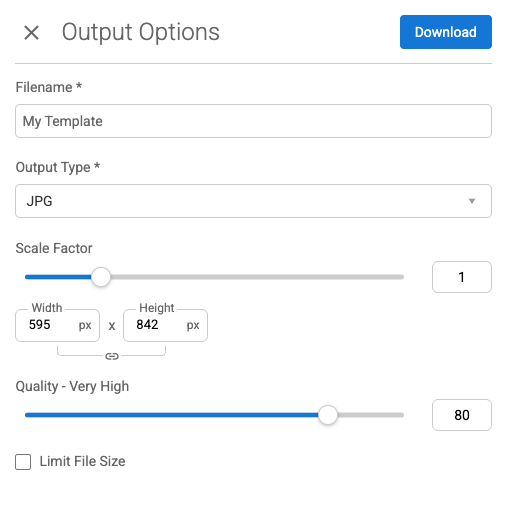
Print templates can now be output as JPG or PNG in addition to PDF. Administrators enable JPG and/or PNG on a print asset type's output configuration. When downloading, users can set a scale factor, width and height (linked to preserve aspect ratio), and — for JPG — a quality slider or a file size limit.
Color Properties in Logic and Quick Logic
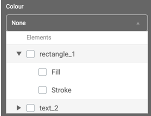
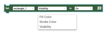
Template authors can now drive element color through logic rules. In quick logic, shape elements show checkboxes for Fill and Stroke so authors can target specific color properties. In the full logic editor, Set Element nodes support Fill Color and Stroke Color for shape elements, and Text Color, Text Stroke Color, and Fill Color for text elements.
Auto-generate Placeholders from Translation Content
Any [[name]] syntax found in template translations is now automatically resolved to a placeholder — no manual creation required. When a template is loaded or translations are updated, placeholders are created or removed automatically to stay in sync with the translation content.
Polygon Element
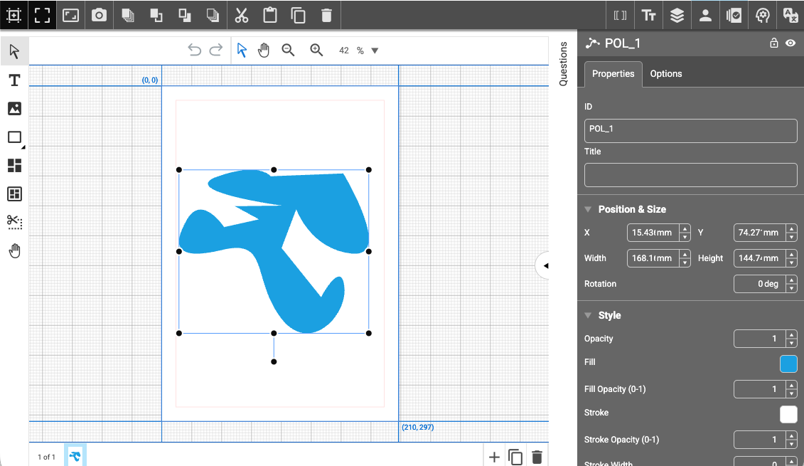
Templates can now include polygon elements imported from InDesign via BGX. Polygons support fill color, stroke color, opacity, drop shadow, and color logic, and can also be used as the basis for color changes driven by color picker questions or user attributes.
Full Justification Options for LTR Text
All four justification options are now available for left-to-right text elements: justify with last line left, justify with last line centred, justify with last line right, and forced justify. These appear as buttons in the frame section of the properties panel.

OpenType locl Feature Support
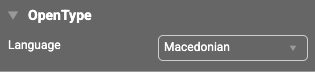
Template authors can now set an OpenType language on a text element using a new Language dropdown in the OpenType panel. When a font contains language-specific glyph variants (for example Bulgarian Cyrillic, Romanian, or Arabic script variants), the correct glyphs are applied in both the canvas preview and the output.
🚀 Platform Features
Managing Brand Assets
We have made further enhancements to our Brand Asset functionality and introduced a new module and permission to control access to this feature.
When the module is enabled on an account, this will automatically trigger the creation of the appropriate Brand Asset type and permission for this feature. The Brand Asset UI provides a dedicated view for managing Brand Copy, Logos, Colors, and Graphic Elements.
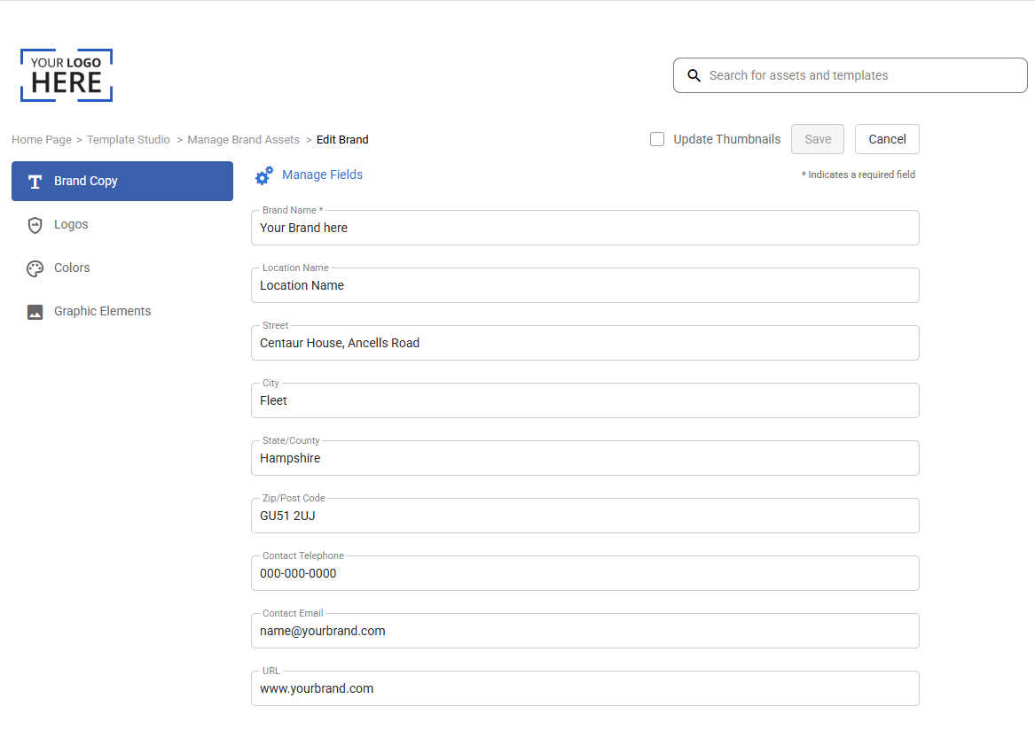
The Logo, Color and Graphic Element attributes are shown on separate tabs and are accessible as follows:
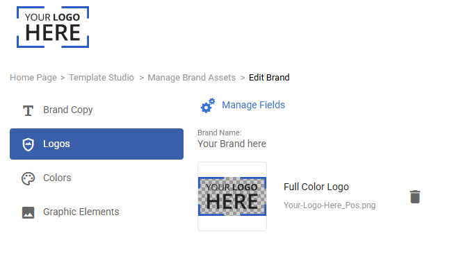
It is also possible to manage the attributes of the Brand Asset by clicking the Manage Fields option:

This gives access to all of the attributes on the Brand Asset, allowing for these fields to be managed (i.e. created, edited, reordered, and deleted):
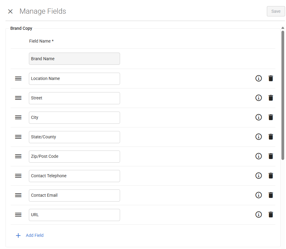
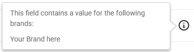
By hovering on the "i" icon, a user can see where an attribute is being used, to help inform them before making a change:
We have also introduced an Update Thumbnail checkbox on the Manage Brand Asset UI. When checked and changes are saved on a Brand Asset, the Update Thumbnail process is triggered for all templates that reference that Brand Asset:
Update Thumbnail Batch Job
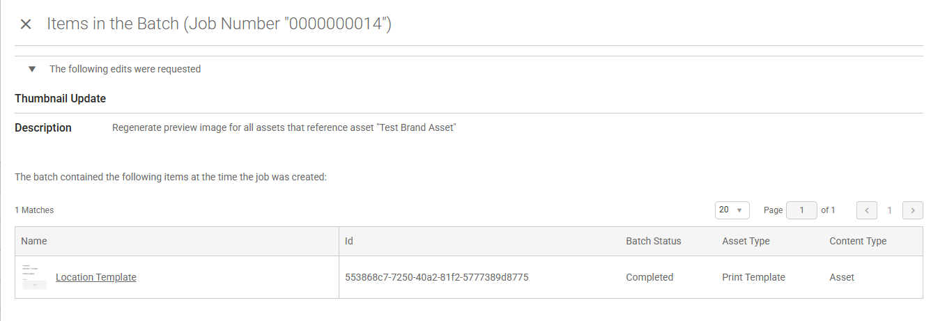
When the Update Thumbnail process is triggered, it will now create an entry in the Batch Jobs list to record that the process has taken place:

By clicking on the "Items in Job" field, an administrator can see the details of the templates that were updated by the process:
Flexible Search Metadata
We have introduced the ability to control how asset attributes are shown on an asset tile in the search results. It is now possible to specify against each attribute on an Asset Type how it is to be shown on the asset tile, using the new "Show on Tile" dropdown:
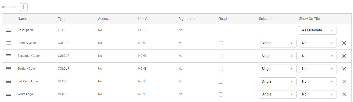
The "Show on Tile" dropdown offers the following options depending on the attribute type:
| Attribute type | As Title | As Metadata | As Hover | Not shown |
|---|---|---|---|---|
| The asset description | ✓ | ✓ | - | ✓ |
| Any text attribute | ✓ | ✓ | ✓ | ✓ |
| Any list attribute | ✓ | ✓ | ✓ | ✓ |
| Any date attribute | - | ✓ | - | ✓ |
| Any color attribute | - | ✓ | - | ✓ |
| Any image attribute | - | - | - | ✓ |
As a result, it is possible to control what attributes are shown for: the title, listed underneath the title on the tile, and when hovering on the "i" icon.
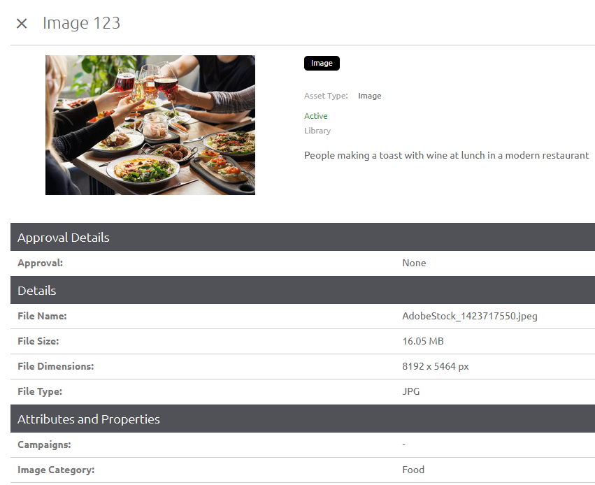
The following shows an example of the title coming from the description field and additional metadata shown on the tile:
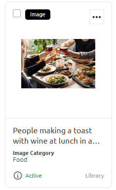
The details of the asset are as follows:
Reorder Text Tabs
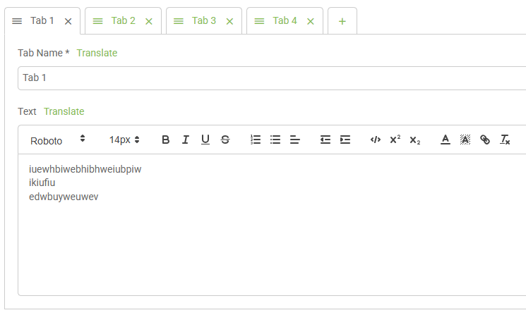
An improvement has been made to the way that multiple tabs are shown in a Text section on a page. Each tab is now shown with a drag handle, allowing the administrator to easily reorder the tabs by dragging them into the desired order:
Preview Option for Archived Content
A new "Preview" option has been added to archived templates and static items. When the Preview option is selected (or the asset is clicked), the Preview page for the template or static item is shown, allowing the administrator to view it without needing to restore it from the archive.
Off-site Tiles and Links
We have introduced a new "Show Off-site Icon" setting on a Tile configuration and also on a Link List configuration. This is for those occasions when the tile or link navigates the user away from the platform:

When the above setting is checked, a new off-site icon is shown alongside the tile:
Or alongside the Link List:
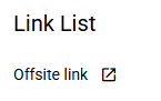
A new Text Color setting has also been added to the Link List configuration, allowing administrators to specify the color of the link text. The off-site icon adopts this same color when displayed.
Access to Page Section Details
This change has been introduced to assist administrators when using the Page Builder functionality. A new "Edit the Page section" pencil icon option is now available at the bottom of the section editor flyout:

When the administrator chooses to edit a section on a page (e.g. a Tile List or Ad Rotator), a new pencil icon option is now available to directly access the associated section configuration. This saves having to exit the section editor and separately locate and select the section to edit:

Application Settings Page
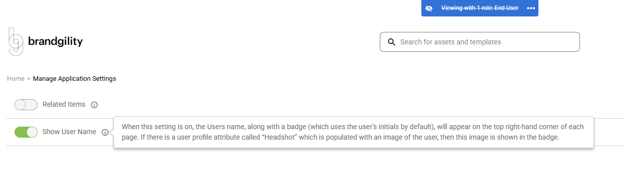
The Application Settings page has been enhanced to clarify the purpose of each option. The option names have been simplified and an "i" icon has been added to each, which when hovered displays a description of what the setting does:
Partner Attributes — Display Rule
We have added an additional control to a Partner attribute called "Display Rule". When used, this allows for logic to be applied to control whether the attribute is shown or hidden during the order process, based on the value of another attribute.
When the "Display Rule" checkbox is checked, a new flyout is shown:
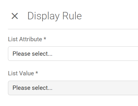
This allows the administrator to select another attribute to be assessed and the value(s) to be checked for. During the order process, if the condition is true then the attribute with the display rule is shown; if false, it is hidden.
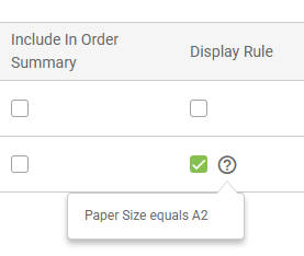
In the example below, the second attribute (Comment) will only appear if the first attribute (Paper Size) has the value "A3":
Brief Request Status Tracking
Additional statuses have been added to the Brief Request functionality. The full status list is now as follows:
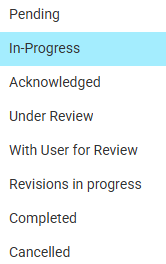
New logic has also been added so that when a user submits a comment or attachment to an existing Brief Request, the status is automatically reset to "Pending". Additionally, whenever a Brief Request status changes, the time spent at the previous status is recorded and stored for reporting purposes.
Description on a Batch Job
A new optional Description field has been added to the Batch Job details, allowing the administrator to add a description for the changes being made: